
US Letter Two Column Report Grid System for InDesign
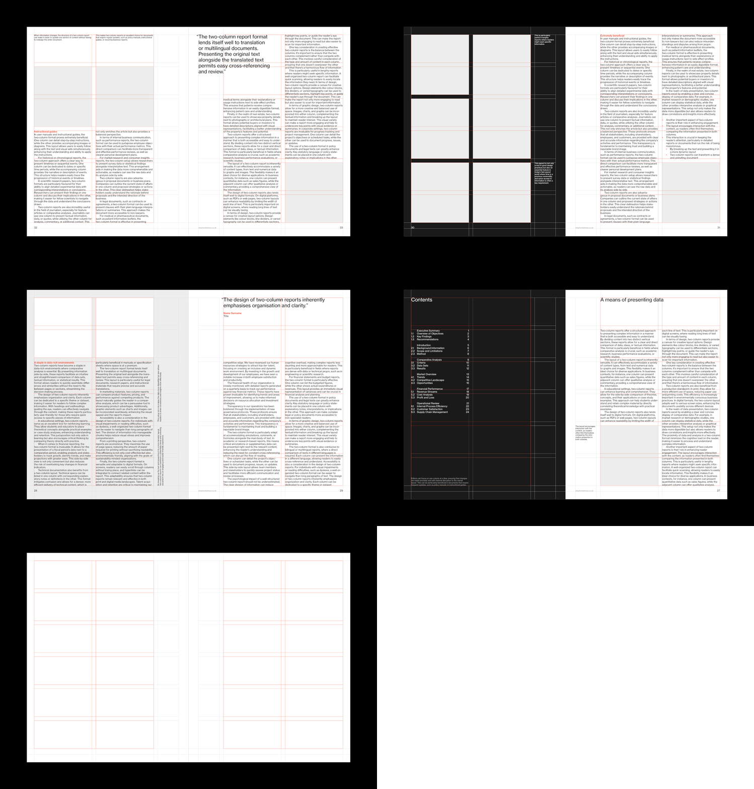
Features
— 12 field modular grid
— Optional margins / captions grid
— 11 pt baseline grid
— Comprehensive style sheets
— Quotation styles
— Proportional leading
— Sample layouts
Also available in A4 format
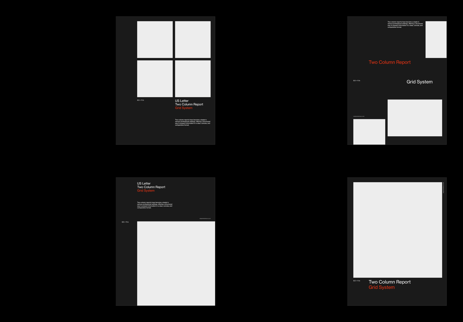

Designed with a two-column structure, this US letter grid system template suits a variety of professional uses – from business reports and white papers to case studies and corporate documents. Drawing on modern Swiss style design principles, it includes typography style sheets and a number of layout examples.


Questions
What is a two column grid?
A two column grid divides the page into two equal measures of text. This US letter format system has a 12-field modular grid and an 11 pt baseline. This is a common foundation for business reports, white papers and corporate documents. A two column layout is particularly useful when you want a document to feel like a significant upgrade on one column solutions (which can look generic) while retaining a degree of simplicity.
When should a report use two columns?
When there’s a lot of content and readers will scan rather than read cover to cover. Two columns shorten the measure, which can aid reading (depending on the content you’re working with), and they make space for sidebars, figures and pull quotes to sit beside the argument rather than interrupt it. For linear, long-form reading, a single column still wins.
How do you keep two columns looking balanced?
Hold both columns to the same baseline grid so lines of text align across the page, and give figures, captions and quotations fixed styles rather than ad hoc treatment. This template builds those controls in – including quotation styles and an optional captions grid.