
A4 Presentation Grid System for InDesign
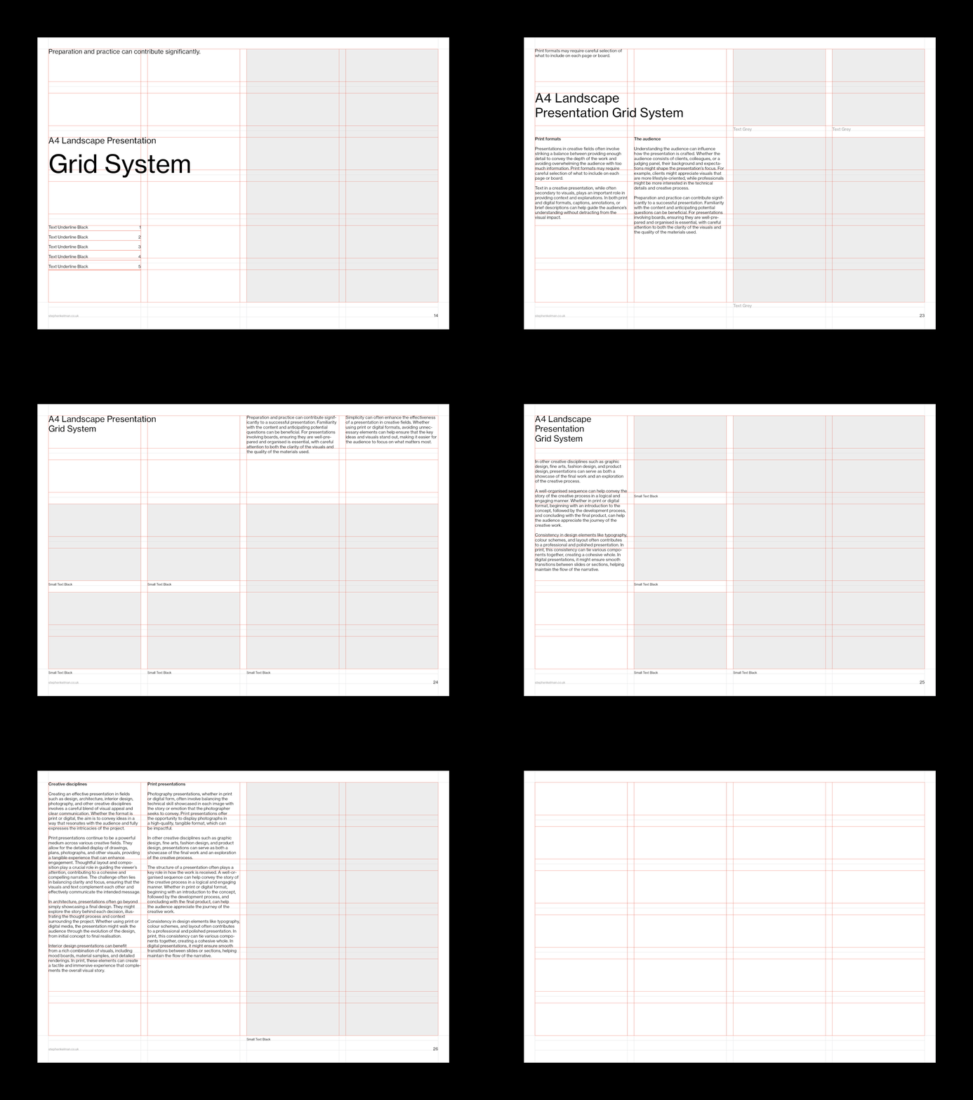
Features
— Image caption grid
— 24 field modular grid
— 10 pt baseline grid
— Comprehensive style sheets
— Proportional leading
— Sample layouts

This A4 landscape InDesign template features Swiss-style typography with modular and baseline grid layouts. Originally designed for architects it is also ideal for designers, photographers, and creatives who need a clear, structured framework for portfolios, presentations, and project boards.
This project is part of a wider set of grid systems in A-Series, North American and digital formats.


Questions
What is an A4 grid system?
An A4 grid system divides the standard A4 sheet into a fixed structure of modular fields, margins and baselines. This grid system has 24 fields on a 10 pt baseline – so every page in a document starts from the same underlying foundation. Type, images and captions all take many of their positional cues from the grid – avoiding time-consuming eyeballing.
Why use A4 landscape rather than portrait for a presentation?
Landscape mirrors the way screens and pin-up walls are viewed, and it gives images more width to work with – which suits portfolios and project boards. Portrait remains the better shape for documents that will be read page by page. This system is also available in portrait.
What layout do architects use for project presentations?
Architects tend to favour minimal layouts – consistent grids, restrained typography and generous white space – because the drawings and visualisations must carry the page. This system was originally designed for architects – that discipline is built into its 24-field structure.