A grid system template for an A3 landscape presentation layout. The design includes multiple horizontal and vertical grid lines, creating sections for text and visual elements. The title “A3 Landscape Presentation Grid System” is displayed prominently at the top left of the layout, followed by labeled text placeholders, such as “Text Underline Black” in the lower left. The grid structure is clean and organized to guide the placement of content.
Features

— Image caption grid
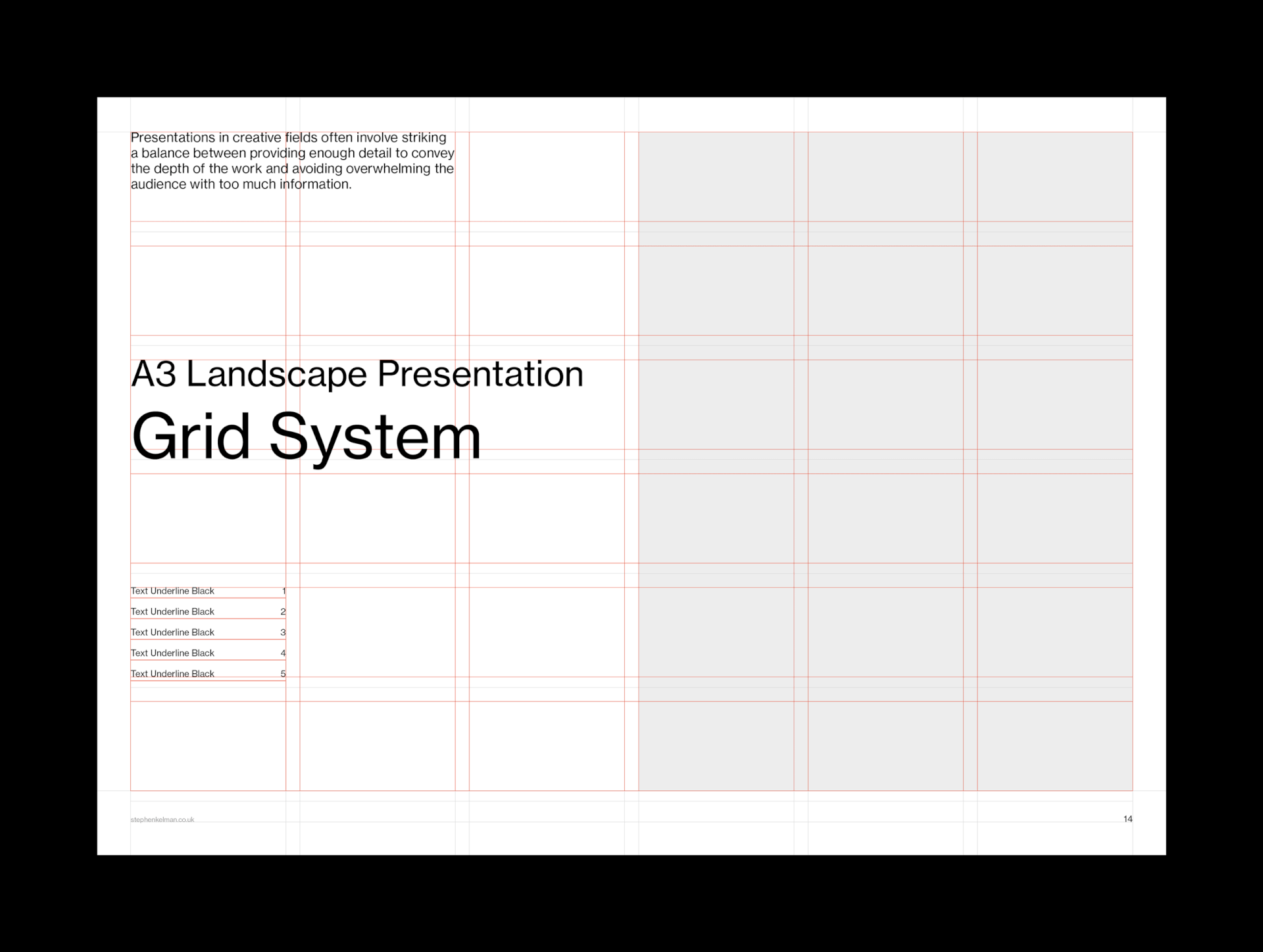
— 36 field modular grid
11.5 pt baseline grid
Comprehensive style sheets
Proportional leading
— Sample layouts
A grid system template for an A3 landscape presentation layout. The left side of the layout features a heading titled “A3 Landscape Presentation Grid System,” followed by text sections labeled “Text Underline Black 1” through “Text Underline Black 5.” The right side of the layout remains empty, leaving space for content placement. The design emphasizes a clean, organized grid structure for content alignment and presentation.
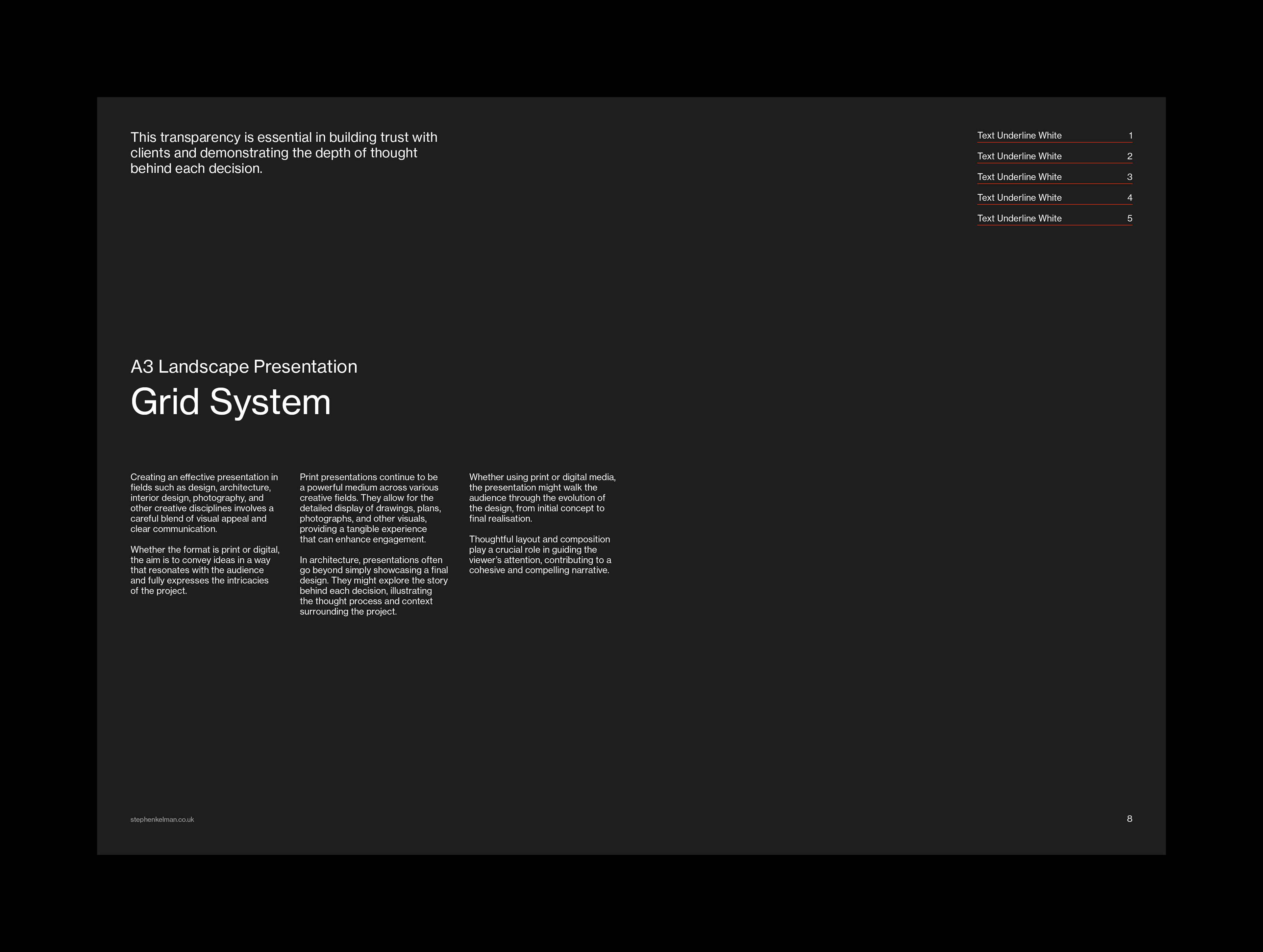
This A3 landscape Swiss-style typography grid template offers designers, photographers, architects and creative professionals the perfect platform for project boards, posters, and content-heavy presentations. The system is ideal for showcasing large visuals and design concepts, prioritising clarity and ease of use.

This project is part of a wider set of grid systems in A-Series, North American and digital formats.
A grid system template for an A3 landscape presentation layout with a dark background. The left side features a heading “A3 Landscape Presentation Grid System” and sections labeled “Text Underline White 1” through “Text Underline White 5” below the title. The right side of the layout remains empty, leaving space for content placement. The design uses a clean, organized grid structure for aligning and presenting content effectively.
A page showing different font styles, including “Header Black” and “Header Medium Black” in various sizes, arranged in two columns. The left column displays the “Header Black” in five different sizes, while the right column showcases “Header Medium Black” and “Text Black” in a different layout. Below these headers, text examples such as “Text Underline Black” and “Text Grey” are shown. The design emphasizes a clean layout, suitable for presentations with various typography and text styles. Additionally, small text blocks like “Small Text Black” and placeholders are also included in the grid system.
A dark-themed page displaying various font styles and sizes. On the left, “Header White” is shown in five different sizes, from the smallest to the largest. The right side displays “Header Medium White” and “Text White” in various layouts, including descriptive text explaining the design context for print presentations, with a particular focus on photography and the importance of visual elements in conveying meaning. Beneath the header text, various text examples such as “Text Underline White” and “Text Grey” are listed, with visual elements such as bullets and small text blocks. The page emphasizes a clean, professional layout ideal for typography and presentation designs.
A clean, minimalist layout displaying the title “A3 Landscape Presentation Grid System” in bold font. Below the title, there is descriptive text highlighting the importance of clear communication in design presentations across various creative fields, including architecture and photography. The text emphasizes the power of print presentations to convey detailed designs and the thought process behind them. It also notes the significance of layout and composition in guiding the viewer’s understanding of the project, regardless of whether the medium is print or digital. At the top right corner, there are five items listed under “Text Underline Black,” each accompanied by numbers 1 to 5.
A clean, minimalist design showing a blank layout with a title “A3 Landscape Presentation Grid System” in large bold text at the bottom left. The page contains empty space above, providing room for a presentation layout. At the bottom right, there are five items labeled “Text Underline Black,” each with corresponding numbers from 1 to 5. This design showcases a blank grid system for presentations with a professional and sleek appearance, suitable for various creative design fields.
A clean, minimalist layout for an A3 landscape presentation grid system. The title “A3 Landscape Presentation Grid System” is displayed in large bold text on a dark background at the top left. Below the title, there is a large blank space, providing room for a grid system design. To the right of the page, there are five items labeled “Text Underline White,” each with corresponding numbers from 1 to 5. This design emphasizes simplicity and clarity, ideal for presenting information or data in an organized format.
A page in a dark-themed layout displaying an A3 landscape presentation grid system. The title “A3 Landscape Presentation Grid System” is prominently displayed in bold white text at the center of the page. Below it, a section provides text describing how effective presentations in fields like design, architecture, and interior design require a careful balance of visual appeal and clear communication. The page is divided into sections with clear explanations on how presentations, whether print or digital, can enhance engagement and illustrate the design process. On the right side, there are five numbered items labeled “Text Underline White” in red. This layout emphasizes simplicity and clarity while offering room for content and visuals.
A page showing an A3 landscape presentation grid system. The page is primarily dark-themed with a large area of white space on the left side. The title “A3 Landscape Presentation Grid System” is prominently displayed in white text at the bottom left of the page. Below the title, there is a section listing five numbered items labeled “Text Underline White,” each with corresponding red numbers. The clean, minimalist layout is designed for effective presentation and clarity. The text and grid system are designed to convey important design concepts.
A page showing the A3 landscape presentation grid system. The left side of the page is filled with white text blocks and a section for “Text Grey.” The title “A3 Landscape Presentation Grid System” is prominently displayed at the top left. The page contains three large blocks labeled “Text Grey,” with a minimalist design intended to focus on the content of the grid system. There are sections discussing topics like “Print formats,” “The audience,” and “Print presentations,” with the text describing how these concepts relate to effective presentation design. The layout and visual components enhance the readability and focus on the information presented.
A3 landscape presentation grid system with placeholders for images and text, designed for professional and creative use.
A page displaying an A3 landscape presentation grid system layout. The page contains several rectangular blocks labeled “Small Text Black,” with multiple areas for content. The text discusses various aspects of presentation design, emphasizing the need for balance between providing enough detail to communicate the message and avoiding overwhelming the audience with too much information. It also addresses the importance of the structure of the presentation and how consistency in layout contributes to a professional and cohesive final product. The content highlights the role of simplicity and clarity in effective presentations, and mentions the specific needs of various creative disciplines such as architecture, photography, and fashion design. The image stresses the value of a well-structured presentation in conveying the story behind the work and enhancing the viewer’s engagement with the material.
A presentation grid system for A3 landscape format with placeholders for text and images, designed for creative and professional use.
Back to Top